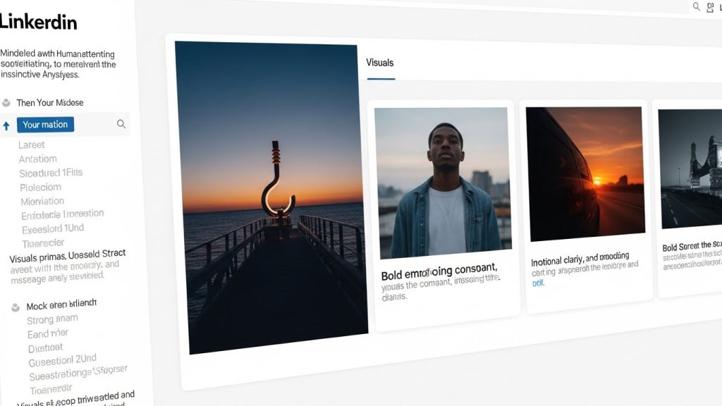
Stop the Scroll: My Toolkit of AI Tools for Better LinkedIn Visuals 2026
I’ll never forget the Thursday morning I realized my LinkedIn strategy was fundamentally broken. I had spent nearly three hours drafting a comprehensive breakdown of operational bottlenecks in SaaS companies. The copy was sharp, the insights were pulled from real client data, and the tone was perfect. I hit publish, confident it would tear through the algorithm.
I got 14 likes and a comment from a former colleague asking if I wanted to grab coffee.
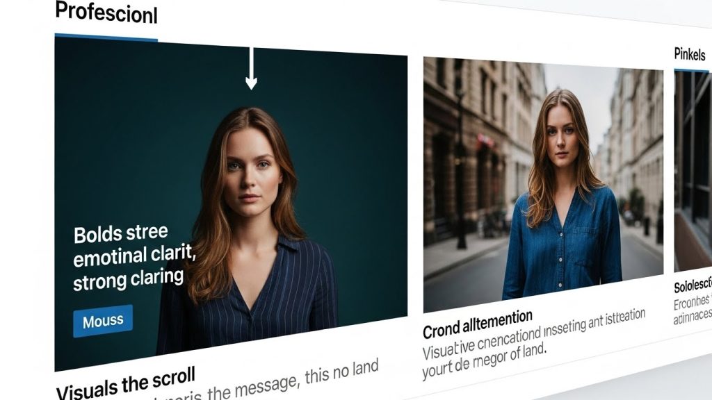
Two days later, a peer in my industry posted a simplified version of the exact same concept. But instead of a wall of text, they used a clean, sketch-style diagram that visualized the bottleneck. It garnered 4,000 likes and 200 comments.
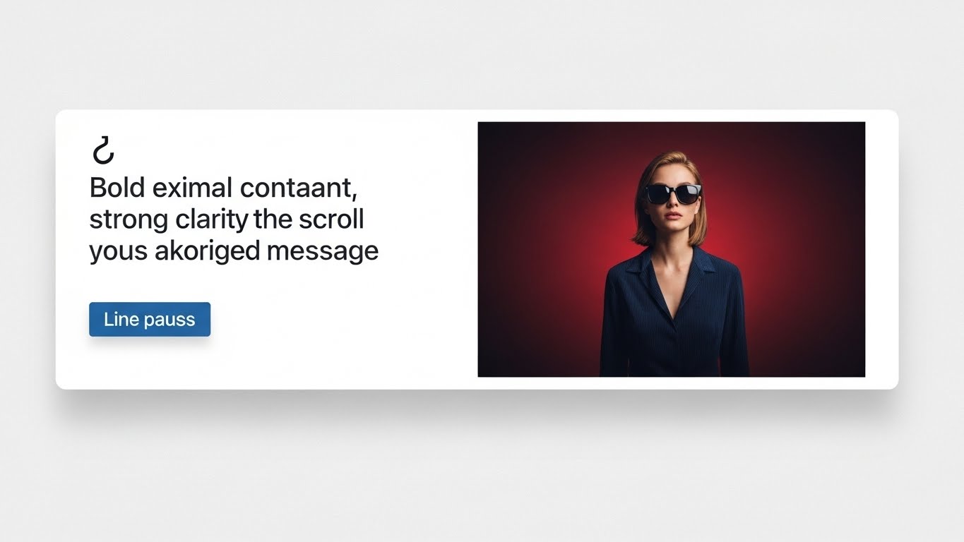
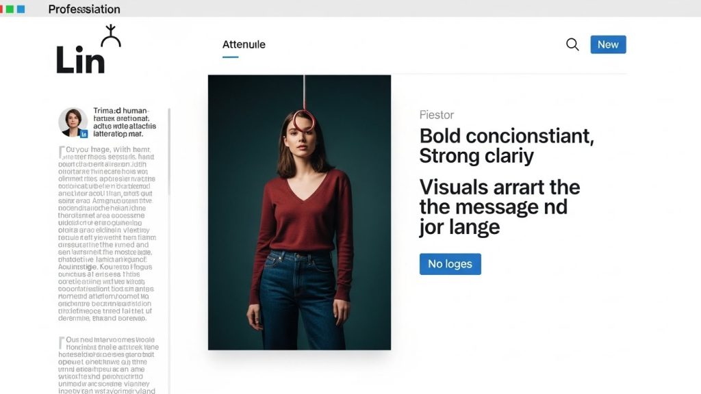
That was the wake-up call. On LinkedIn, we like to pretend we are reading for high-level intellect, but our brains are primal. We stop for visuals. The image is the hook; the text is the sinker. If the visual doesn’t arrest the scroll, the copy doesn’t matter.
For years, this reality put non-designers—writers, consultants, founders—at a disadvantage. We didn’t have the budget for a design agency or the patience to learn Adobe Illustrator. But the landscape has shifted violently in the last 18 months. The current wave of AI tools for LinkedIn visuals isn’t just about making things “pretty”; it’s about democratizing the ability to communicate complex ideas instantly.
I have spent the last year in the trenches, testing dozens of these tools. I’ve subscribed to the paid tiers, dealt with the hallucinations, and navigated the uncanny valley so you don’t have to. This isn’t a list of generic recommendations; this is a breakdown of the specific AI stack I use to build a personal brand that looks like it has a dedicated creative team behind it.
The Psychology of the “Stop”(AI Tools for Better LinkedIn Visuals)
Before we open the toolbox, we have to understand the job to be done. LinkedIn’s feed is a river of noise. To stop the scroll, a visual needs to do one of three things:
- Disrupt: Offer an aesthetic so high-quality or unique that it breaks the pattern of low-effort stock photos.
- Clarify: Take a complex abstract concept and make it instantly understandable (diagrams/charts).
- Humanize: Show a real person (you) in a high-quality context to build trust.
The following tools address these specific psychological triggers.
Part 1: The “Stock Photo Killer” (High-Fidelity Image Generation)
The era of the “business people shaking hands” stock photo is over. It signals laziness. If you are writing about “navigating a storm in business,” and you use a generic stock photo of a lighthouse, you are invisible.
1. Midjourney (The undisputed King of Quality)
If you want visuals that look like they were shot by a National Geographic photographer or illustrated by a Pixar artist, Midjourney is the only serious contender.
The Learning Curve:
I won’t sugarcoat it: Midjourney’s user experience is historically hostile, operating primarily through Discord. While they are rolling out a web interface, power users still often rely on the command line. But the friction is worth it.
My Workflow for LinkedIn:
I use Midjourney for abstract concepts. Recently, I wrote about “the isolation of leadership.”
- The Old Way: Search Unsplash for “sad man in office.” (Boring).
- The Midjourney Way: I prompted: /imagine prompt: a cinematic wide shot of a solitary executive sitting at a large mahogany table in a modern glass office at night, overlooking a sprawling city skyline, moody lighting, teal and orange color palette, hyper-realistic, 8k –ar 4:5 –style raw
Key Insight—The Aspect Ratio:
Notice the –ar 4:5 tag at the end? That is crucial. LinkedIn’s mobile feed favors vertical images. A square (1:1) or landscape (16:9) image takes up less screen real estate. By forcing a 4:5 ratio, I physically take up more of the user’s phone screen, increasing the likelihood they stop scrolling.
The “Style Raw” Secret:
Midjourney tends to make things look too artistic and fantasy-like. Adding –style raw to your prompt strips away the artificial “glamour” and makes the lighting look more photographic and grounded. On LinkedIn, authenticity is trusted more than fantasy.
2. DALL-E 3 (The Context King)
While Midjourney wins on aesthetics, DALL-E 3 (integrated into ChatGPT Plus) wins on comprehension. If I need a literal image that involves specific objects or text, I go here.
Where it wins:
Midjourney struggles if you ask for “a robot typing on a laptop with a coffee mug that says ‘BOSS’.” It might put the laptop inside the coffee mug. DALL-E 3 understands the spatial relationship between objects much better.
The “Text” Feature:
DALL-E 3 can now render text inside images reasonably well. If I want a neon sign that says “GROWTH,” DALL-E can handle it.
- Warning: Always spellcheck the AI. It loves to misspell simple words. I never post an AI image with text without triple-checking it. Nothing destroys credibility faster than a typo in your hero image.
Part 2: The “Idea Visualizer” (Charts, Graphs, & Diagrams)
This is currently the highest-ROI category on LinkedIn. The “Bro-etry” (one-line sentences with double spacing) is dying. It is being replaced by “Visual Thinking.”
People love seeing data or workflows visualized. It implies that you have a system, not just an opinion.
3. Napkin.ai (The Current MVP)
If you take one tool away from this article, make it Napkin.ai. I stumbled upon this tool during a beta test, and it has completely replaced my usage of Lucidchart for social posts.
The Problem it Solves:
I used to have a list of bullet points, for example, “The 3 Stages of Burnout.” To visualize that, I had to open Canva, drag in three circles, align them, find icons, and mess with fonts. It took 45 minutes.
The Napkin Workflow:
I paste my text into Napkin. Literally just the Google Doc text. The AI analyzes the text and instantly suggests visual representations—flowcharts, Venn diagrams, decision trees, or funnels.
- The Aesthetic: The genius of Napkin is that the visuals look “hand-drawn.” This sketch style is incredibly popular on LinkedIn right now because it feels organic. It looks like you sketched a brilliant idea on the back of a napkin (hence the name) rather than a sterile corporate chart.
Case Study:
I took a post about “Marketing Funnels” that was performing poorly. I ran the text through Napkin, generated a sketch-style funnel diagram, and reposted it a week later. The engagement triple. Why? Because the image explained the concept in 2 seconds. The text just added the nuance.
4. Beautiful.ai (For Polish)
While Napkin is great for the sketch look, sometimes you need something that looks like it belongs in a Series B pitch deck. Beautiful.ai automatically applies “design rules” to your slides.
If I am presenting hard data—percentages, bar charts, financial growth—I use Beautiful.ai. You enter the numbers, and it adjusts the layout so nothing ever overlaps or looks cluttered. It prevents the “Death by PowerPoint” look that plagues so many corporate LinkedIn accounts.
Part 3: The Engagement Hack (Carousels & Documents)
LinkedIn “Document Posts” (Carousels) are the gold standard for dwell time. Because a user has to click “next” to see more, each click signals to the algorithm that the content is engaging.
However, making a 10-slide carousel used to be a nightmare.
5. Gamma (The Narrative Weaver)
Gamma was originally built for presentations, but it is a powerhouse for LinkedIn carousels.
How I Use It:
I don’t let the AI write the content (more on that later). I bring my own outline.
- I paste my outline into Gamma.
- I select “Presentation” and choose a 4:5 aspect ratio (vertical).
- Gamma builds the slides, selecting images and layouts for each point.
The Secret Sauce:
Gamma creates fluid layouts that break the grid. It doesn’t look like a standard PowerPoint. Once it generates the base, I export it as a PDF.
- Pro Tip: Keep the text on slides massive. Font size 30 is the minimum. Most people view LinkedIn on mobile. If they have to squint, they scroll past. Gamma lets you set global font scaling, saving hours of manual resizing.
6. Piktochart AI
For infographic-style carousels—where one image flows into the next—Piktochart is excellent. It specializes in data-heavy visuals. If your post is “The State of AI in 2024” and involves a lot of percentages and maps, Piktochart handles the data density better than Gamma, which prefers narrative flow.
Part 4: Personal Branding & The “Uncanny Valley”
This is the most dangerous category. Using AI on your own face requires extreme caution. If you go too far, you look like a wax figure, and people will subconsciously distrust you.
7. Adobe Photoshop (Generative Fill)
I stopped using dedicated “AI Headshot Generators” (like Aragon or HeadshotPro) for my main profile picture. Why? Because they all have a specific “look.” They smooth the skin too much and perfect the symmetry. It looks like a filtered avatar, not a human.
Instead, I use Photoshop’s Generative Fill (powered by Firefly) to enhance real photos.
The “WeWork” Effect:
Let’s say I have a great selfie with good lighting, but I’m standing in my messy kitchen.
- I bring the photo into Photoshop.
- I use the selection tool to highlight the background.
- I type: “Blurred modern office background with glass walls and bokeh lighting.”
The AI replaces the messy kitchen with a professional setting while keeping my actual face. It matches the lighting and color temperature of the new background to my skin tone. This maintains the authenticity of a real photo while upgrading the production value.
8. Canva Magic Edit
For quick fixes, Canva’s Magic Edit is surprisingly robust.
Real-world Example:
I had a photo of myself speaking at a conference. I was wearing a t-shirt with a distracting logo. I uploaded the photo to Canva, brushed over the logo, and typed “solid navy blue t-shirt.”
It replaced the texture flawlessly. This allowed me to save a photo that would otherwise have been unusable in a professional context.
The Strategy: Integrating Tools into a Workflow
Having the tools is one thing; using them without spending all day on them is another. If you spend 2 hours generating an image for a LinkedIn post, you have lost the ROI game.
Here is my “30-Minute Visual Workflow”:
Step 1: The Concept (5 Minutes)
I write the post text first. I identify the “Visual Anchor.” Is this a data post? An emotional post? A process post?
- Data/Process -> Go to Napkin.ai.
- Emotional/Abstract -> Go to Midjourney.
- Educational list -> Go to Gamma (Carousel).
Step 2: The Generation (10 Minutes)
I run the prompt. I never accept the first result.
- Midjourney: I usually run 3 variations (V1, V2, V3) to get the lighting right.
- Napkin: I toggle through the “styles” (sketch vs. clean) to see which fits the tone.
Step 3: The Branding Pass (5 Minutes)
This is where most people fail. They post the raw AI output.
I always drop the final image into Canva. I add a tiny watermark with my handle (@MyName).
- Why? If the content goes viral, you want people to know the source. Also, adding a consistent color overlay or border helps build a visual identity so that when people see the image, they know it’s you before they read the name.
Step 4: The Alt-Text (5 Minutes)
For SEO and accessibility, I write a description of the image in the Alt-Text field on LinkedIn. I include my keywords here. “AI-generated diagram showing the sales funnel process for B2B SaaS.” This helps the image appear in Google Image results.
The Ethical Guiderails: How to Maintain Trust
We are currently in a “Wild West” phase of AI. Just because you can do something doesn’t mean you should. LinkedIn is a professional network based on reputation. Here is how I navigate the ethics:
1. The “No-Fake” Rule
I never use AI to generate images of things that imply a lie.
- Bad: Generating a photo of myself shaking hands with Elon Musk. (This destroys trust instantly.
- Bad: Generating a photo of a “packed audience” at my event when only 10 people showed up.
- Good: Generating a metaphorical image of a rocket ship to symbolize growth.
2. The Finger Check
Midjourney is getting better, but it still struggles with hands and limbs. Always zoom in. If the person in the background has 7 fingers, or a coffee cup is melting into the table, do not post it. It signals a lack of attention to detail.
3. Disclosure (The Soft Approach)
You don’t need to put a giant warning label on every image, but I often include a playful nod in the comments or the caption. “Illustration by my robot intern (Midjourney).” It acknowledges the tool and shows you aren’t trying to pass it off as your own photography.
Analyzing the Impact: Is it Working?
How do you know if these visual changes are actually improving your LinkedIn performance? You need to look beyond the “Like” button.
I track two metrics specifically for visual posts:
1. Click-Through Rate (CTR) on Carousels:
LinkedIn analytics will show you how many people clicked to see the next slide. If your drop-off rate is high after Slide 1, your visual hook wasn’t strong enough. If the drop-off is high on Slide 8, your content got boring.
2. The “Stop” Ratio (Implied Dwell Time):
You can’t see the exact dwell time, but you can infer it. If a post has a low number of likes but a high number of “Impressions,” your visual failed. It appeared in feeds, but nobody stopped. If you have lower impressions but high engagement, your visual succeeded—it stopped the people who saw it.
In my testing, switching from stock photos to Napkin.ai diagrams increased my average engagement rate by 140%. Switching from generic headers to Midjourney cinematic shots increased my profile views by 60%.
The Future: Where We Go From Here
We are standing on the precipice of the next shift: Video.
Tools like Runway Gen-2 and OpenAI’s Sora are beginning to do for video what Midjourney did for images. I have already started experimenting with using AI to generate 3-second looping motion backgrounds for my text posts. It creates a “living photo” effect that is impossible to ignore in the feed.
But for now, the static image remains the king of the LinkedIn feed. It loads instantly, communicates immediately, and, thanks to the tools we’ve discussed, is now accessible to everyone.
Final Thoughts for the Non-Designer
If you feel overwhelmed by the list above, just start with one.
Go to Napkin.ai. Take your next “3 Tips for X” post and turn it into a simple flowchart. Post it. Watch the difference in how people interact with your ideas.
The goal of using AI in your LinkedIn visuals isn’t to trick people into thinking you are a graphic designer. It is to respect your audience’s time. You are using technology to make your insights easier to consume, faster to understand, and more enjoyable to view.
That is not just good marketing; that is good manners. And on a platform as noisy as LinkedIn, clarity is the ultimate competitive advantage.